

Just apply composition, color, and typography to shape your vision into art; concept clarity drives decisions, poor contrast risks unreadability, and bold visual impact increases engagement and recognition.
Key Takeaways:
- Define a clear concept by stating the message, target audience, and intended emotion.
- Moodboards and sketches help explore visual directions and speed up decision-making.
- Color and typography choices set tone, establish hierarchy, and improve readability.
- Hierarchy and grid-based layouts guide attention and create balanced compositions.
- Prototype and iterate quickly with mockups and user feedback to refine ideas into polished art.
- Master crucial design tools and maintain an organized asset library for consistency and efficiency.
- Present designs with concise storytelling and contextual examples to show intent and application.
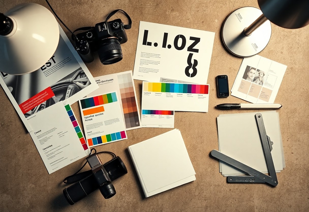
Understanding the Core Factors of Visual Communication
You align visual choices with message, using visual hierarchy, contrast, and color theory to guide perception while avoiding misleading color choices that can harm clarity. The way you balance clarity and creativity determines whether your design communicates or confuses.
- Visual hierarchy
- Typography
- Color theory
- Contrast
- Composition
Defining the Purpose and Target Audience
Identify who you design for and which action you expect, mapping demographic needs to tone, format, and typography so messaging stays focused and resonant with users.
Analyzing Key Factors That Drive Viewer Engagement
Consider how contrast, scale, and negative space control attention and establish reading order. Knowing which elements arrest attention helps you optimize layouts and calls to action.
- Contrast
- Scale
- Negative space
- Motion cues
Explore behavior signals like dwell time, scroll depth, and click-through to measure engagement and validate your design choices. Knowing how visual cues map to behavior lets you iterate with precision.
- Dwell time
- Scroll depth
- Click-through
How-to Master the Fundamentals of Layout and Composition
Start refining layouts by establishing a clear grid and consistent alignment so you can place elements with intention. Use scale, contrast, and spacing to create flow that lets the viewer scan quickly; assign a strong focal point and remove clutter that dilutes the message.
Implementing Visual Hierarchy to Direct the Eye
Scale and contrast guide the eye: when you make a headline significantly larger or higher-contrast, you assign it priority. Pair typography weight and color blocks to create a clear reading path; mark poor contrast as dangerous because it can hide calls-to-action and reduce accessibility.
Utilizing Negative Space to Enhance Design Clarity
Whitespace gives elements room to breathe and clarifies relationships; when you reduce clutter you heighten emphasis on key visuals. Keep margins consistent and let negative space frame your focal point so you deliver a clean, readable composition.
Allowing empty zones around elements increases perceived quality and guides attention without extra ornament. Be mindful that too little space creates visual noise while too much can break cohesion; you should test proportions until you find balance that supports your message.
How-to Utilize Modern Design Software and Digital Tools
Choosing the Right Platform for Vector versus Raster Art
Graphics work determines whether you pick vector or raster: if you need logos and infinite scalability, use vector tools like Adobe Illustrator or Affinity Designer; if you handle photos or textured composites, choose raster tools such as Adobe Photoshop or Procreate. You must watch exports closely because using the wrong format can ruin print clarity and cost time.
Leveraging Industry-Standard Assets to Streamline Production
Vector and raster asset libraries speed production by providing templates, icons, and mockups you can adapt; you save hours by starting from a vetted base. Keep assets properly licensed to avoid legal exposure and maintain consistent branding, since unlicensed components can trigger takedowns or costly rework.
Libraries synced via cloud tools and plugins let you share color styles, components, and version history so you and your team don’t overwrite files; adopt clear naming and version control to protect deliverables and reduce rework.

Practical Tips for Refining Your Creative Workflow
Streamline your approach by blocking focused time for research, sketching and rapid prototyping so you can test concepts without context switches; you should standardize file naming and version control to prevent lost iterations and cut rework. You can keep a concise toolkit of palettes and fonts to reduce decision fatigue and consult The Art of Graphic Design: Turning Ideas into Visual … for examples. Recognizing the cumulative hours you save by these habits will sharpen outcomes.
- workflow
- prototyping
- version control
Developing a Mood Board to Solidify Your Concept
Collect a tight selection of images, textures and type samples that reflect the tone you want so you can align stakeholders quickly; you should label color swatches and note usage intent to avoid mixed signals. Use the board as a living reference during production and highlight any brand constraints that affect choices.
Tips for Iterative Editing and Incorporating Feedback
Set short review cycles that target one variable per pass-color, layout or copy-so you can evaluate impact and avoid scatter; you should timestamp versions and log why each change happened to keep context. Keep notes that point to measurable goals and flag any conflicting directions.
- iteration
- feedback
- prioritization
Prioritize client and user comments by grouping similar notes and assigning clear action levels so you can address the most meaningful items first; you should prototype small adjustments before full implementation. After you triage feedback, implement fixes from highest to lowest impact.
Factors for Optimizing Final Exports for Print and Web
Check color spaces, resolution and bleed for print, and confirm sRGB, compression and responsive sizes for web so you preserve fidelity; you should embed fonts for PDFs and provide multiple image scales for screens. Use test prints and device previews to catch rendering issues. The export settings must reflect the intended medium and proof targets.
- color profiles
- resolution
- file formats
Adjust export presets to produce consistent results across printers and browsers and automate exports where possible so you reduce manual errors; you should keep a documented checklist for each format and finalize a labeled master file. The final package should include the master, proofs and optimized variants.
- masters
- proofs
- optimized variants

Conclusion
Following this, you can turn concepts into striking visuals by mastering composition, color theory, typography, and iterative critique. You should prioritize clarity of message, consistent visual hierarchy, and thoughtful use of tools to refine ideas into polished work. You will build a dependable process that makes creative decisions faster and outcomes more impactful.
FAQ
Q: How do I turn a concept into a clear visual direction?
A: Start by defining the core message and the audience you want to reach. Create a moodboard with images, color samples, and typographic examples that capture the feeling of the idea. Sketch multiple thumbnails to explore composition, symbols, and visual metaphors before committing to a direction. Build refined assets in vector or raster tools, test them in context, and iterate based on feedback and usability observations.
Q: What graphic design tools should I use to develop ideas into polished art?
A: Use a vector editor like Adobe Illustrator or Affinity Designer for logos and scalable artwork. Add a raster editor such as Photoshop or Procreate for texture, photo editing, and painterly effects. Employ layout and prototyping tools like InDesign or Figma for multi-page documents and interactive presentations. Keep color palette generators and font managers available to speed selection and organization.
Q: How can I create a compelling and balanced color palette?
A: Pick a dominant color that reflects the mood or message of your piece. Apply basic color theory to choose complementary, analogous, or triadic accents, and limit the palette to three to five colors for clarity. Verify contrast and legibility across backgrounds and sizes, and check accessibility ratios for text. Prepare light and dark variations and test colors in realistic mockups before finalizing.
Q: What role does typography play in expressing an idea visually?
A: Typography establishes tone and readability for your design. Set a clear hierarchy using size, weight, and spacing so viewers can scan information quickly. Pair a distinctive display or headline face with a neutral, readable body font and fine-tune tracking, leading, and alignment for visual balance. Document typographic choices in a brief style guide to keep application consistent.
Q: How should I package and present final designs to clients or audiences?
A: Present final work with context that explains how the design addresses the original brief and where it will be used. Include high-quality mockups, export-ready files in required formats, and a concise style sheet listing colors, type, spacing, and usage rules. Provide alternative layouts or responsive versions for different media and a checklist of assets, specs, and next steps for production or handoff.