

Engagement depends on clear visuals; you must use bold hierarchy, avoid dangerous clutter that kills clicks, and apply contrast and motion to increase response. Explore Advanced graphic design tips and tricks for social media for concrete tactics.
Key Takeaways:
- Use bold, readable typography and a clear hierarchy to guide viewers’ attention and improve scannability.
- Apply contemporary color palettes-duotone, gradients, or muted pastels-to match mood and boost shareability.
- Add subtle motion and micro-interactions for hover/click feedback to increase time on page and interaction rates.
- Prioritize composition and white space to reduce clutter and make calls to action stand out.
- Create consistent visual systems with grids, iconography, and templates to speed production and reinforce brand recognition.
- Optimize designs for mobile-first and responsive breakpoints so content reads and converts across devices.
- Test variations with A/B metrics-color, CTA size, image style-to identify which elements drive clicks and shares.
How-to Implement Bold Minimalism for Modern Branding
Strip design to a few decisive elements so you control visual priority; you select one bold type, a strict color duo, and iconography that signals function. Removing visual clutter increases recall, but avoid eliminating cues that explain what users should do next.
Techniques for simplifying complex messaging through design
Simplify copy into a clear hierarchy: concise headlines, short supporting lines, and icon-led bullets that let you scan fast. Clear hierarchy improves comprehension, while over-condensing can obscure your value proposition, so test progressive disclosure and prioritize the most actionable info for users.
How-to utilize negative space to highlight key call-to-actions
Place generous whitespace around your CTAs so you isolate and amplify their presence; you increase perceived importance with scale, contrast, and centered alignment. Proper spacing often boosts conversions, and crowding CTAs reduces clicks, so keep surrounding elements minimal.
Balance spacing across breakpoints by using a grid and consistent padding so your CTA remains dominant on every device; you should also size touch targets for accessibility and run A/B tests on spacing to confirm behavioral gains.
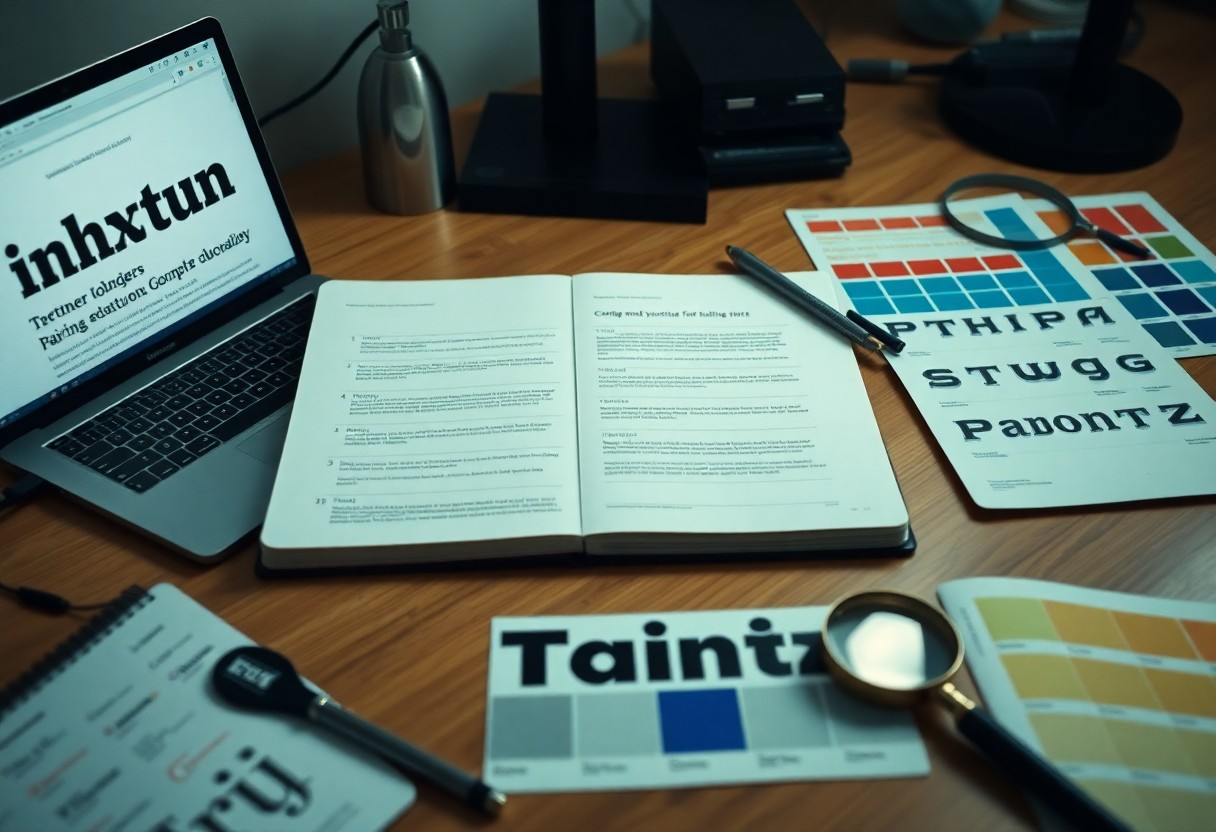
Expert Tips for Selecting Trendy Typography and Font Pairings
When you choose font families, prioritize clear hierarchy and measurable contrast so readers scan naturally, and avoid tiny display faces for body copy to prevent poor legibility.
- Typography: define primary and secondary roles
- Font pairings: mix styles for readable contrast
- Legibility: test at small sizes and on devices
- Hierarchy: use weight, size, and scale
Follow a simple limit of two families with varied weights to keep layouts coherent. After you test pairs on multiple screens, choose the combination that maximizes readability and suits your brand tone.
Tips for combining serif and sans-serif fonts for contrast
- Serif: use for headings to add personality
- Sans-serif: use for body to aid fast scanning
- Contrast: balance x-height, weight, and spacing
Pair a bold serif heading with a neutral sans-serif body to create immediate visual separation. This improves scan speed and maintains comfortable reading across sections.
Best practices for ensuring legibility on mobile devices
Optimize text for small screens by raising base size (≥16px), increasing line-height, boosting color contrast, avoiding thin or condensed faces, and validating spacing on actual devices so you catch issues invisible in desktop previews.
How-to Incorporate Motion Graphics to Increase Social Media Interaction
Adding dynamic elements to static imagery for better engagement
Animate static posts by adding subtle motion-micro-interactions, parallax shifts, and overlayed GIFs-to draw attention when users scroll and boost your engagement. Any movement should support your message and not distract viewers.
- micro-interactions – short, looped accents
- parallax – layered depth for focus
- GIF overlays – brief, attention-grabbing clips
Tips for optimizing video and GIF files for faster loading
Compress your videos and GIFs with modern codecs and sensible bitrates so you keep file size low while maintaining perceived quality; shorten durations and trim unnecessary frames for faster playback. Any improvement in load speed reduces drop-off and increases interaction.
- H.264 – broad compatibility
- HEVC – higher compression for large assets
- WebP – efficient for short animations
Preview uploads on mobile and throttled networks so you can spot buffering, autoplay quirks, or heavy data use for your audience; enable adaptive streaming where possible to maintain smooth playback. Any device test will reveal tweaks that cut load times further.
- adaptive streaming – adapts to bandwidth
- bitrate ladder – multiple quality levels
- lazy loading – defer offscreen media

Key Factors for Creating High-Conversion Data Visualizations
- Visual hierarchy – guide attention with size, contrast, and spacing
- Clarity – label axes, avoid jargon, and keep annotations concise
- Accuracy – show full scales, disclose methodology, and verify calculations
- Color contrast – use palettes that support accessibility and focus
- Call-to-action – direct the viewer toward the next step to boost conversion
How-to turn boring statistics into engaging infographics
Start by picking a single narrative and trimming excess data so you can transform dense tables into clear visuals; you should use icons, microcharts, and color contrast to draw the eye, label key points, and add a concise call-to-action that nudges engagement.
Balancing aesthetic appeal with data accuracy and clarity
Focus on preserving accuracy: you should avoid truncating axes or smoothing variance in ways that produce misleading scales, keep type and spacing consistent for clarity, and annotate methods so users trust the result.
Any aesthetic choice must serve the data, so you should test palettes for contrast and accessibility, validate numbers before publication, and favor legibility over decoration to protect credibility and conversion.
How-to Apply Trendy Graphic Design Essentials To Boost Engagement
You can enforce brand consistency across platforms by locking core elements-logo placement, primary color palette, and typography-while giving designers controlled space to apply trendy design accents that drive engagement. Use shared templates, a component library, and routine visual audits to catch drift early. 7 Principles of Design to Increase Engagement and Boost …
- Brand consistency: define unchangeable elements
- Trendy design: confine trends to accents
- Engagement: A/B test per channel
- Centralized assets: enforce naming and version control
How-to adapt trendy design elements to fit your core brand identity
Craft micro-trends into your visual system by converting bold palettes into accent swatches, translating experimental typography into approved headings, and keeping imagery aligned with your brand identity so you preserve recognition while signaling freshness to audiences.
Streamlining the design workflow for multi-channel asset creation
Streamline processes by building responsive templates, automating exports, and standardizing file naming so teams can produce platform-ready assets quickly while protecting brand consistency.
Automate repetitive tasks with scripts or batch exports, maintain a shared component library for rapid adaptations, and run lightweight QA checks before publishing. After you set automated checks and clear version controls, you reduce errors and keep engagement consistent across channels.

Final Words
From above you apply contrast, clear hierarchy, bold typography, and thoughtful color to grab attention and guide users to act. You should A/B test layouts, measure engagement metrics, and iterate quickly to improve click-throughs and shares while staying consistent with your brand voice.
FAQ
Q: What color strategies from current trends increase engagement?
A: Use a focused palette of 3-5 colors that includes one dominant hue, a contrasting accent for CTAs, and neutral tones for backgrounds and text. Apply gradient overlays and duotone treatments sparingly to attract attention without overpowering content. Test contrast ratios to ensure readability and accessibility for users with vision differences. Match color temperature and saturation to your brand voice: warmer, saturated tones for energetic brands; cooler, desaturated tones for calm, professional brands. Run quick A/B tests on CTA colors and background combinations to measure click-through and time-on-page differences.
Q: How should I choose and pair typography to boost readability and click rates?
A: Prioritize clear hierarchy with distinct styles for headings, subheadings, body text, and CTAs. Combine one display or headline font with one neutral readable font for body copy to maintain visual interest without clutter. Use variable fonts to adjust weight and width responsively while keeping file sizes small. Set line-height between 1.3 and 1.6 and a readable font-size baseline that scales for mobile. Limit decorative type to short headlines and ensure web-font loading strategies (preload critical fonts, use font-display: swap) to reduce layout shifts. Test combinations on real content to check legibility and conversion impact.
Q: Which layout and composition techniques from current design trends increase user engagement?
A: Implement strong visual hierarchy using scale, contrast, and whitespace to guide the eye toward key actions. Use asymmetric and broken-grid layouts to create memorable compositions while maintaining clear reading paths. Create modular cards for content that adapt cleanly to different viewports. Place the primary CTA within the first visual fold and repeat it subtly further down long pages. Manage spacing consistently with a defined spacing scale and rely on focal imagery or bold typography to form clear entry points for interaction. Monitor engagement heatmaps to refine placement of high-impact elements.
Q: What role do imagery, illustrations, and icons play in boosting engagement, and how should I apply them?
A: Choose imagery that aligns with your audience: authentic photos for trust and relatability, custom illustrations for personality and differentiation. Apply consistent treatments such as duotone overlays, soft gradients, or muted palettes to create unity across visuals. Optimize images for performance with modern formats (WebP, AVIF) and appropriate compression. Use concise, descriptive alt text to improve accessibility and SEO. Match icon style to the overall design-outline, filled, or hand-drawn-and keep a consistent stroke weight and spacing to maintain clarity at small sizes.
Q: How can motion and micro-interactions be used to increase engagement without distracting users?
A: Introduce subtle motion to provide feedback and draw attention to interactive elements: micro-animations on hover, gentle button reveals on scroll, and small loading indicators that communicate progress. Keep durations short (100-300ms) and use easing curves that mimic natural movement for comfortable perception. Respect user preferences by honoring reduced-motion settings in CSS and providing non-animated fallbacks. Limit motion to areas that benefit from clarity or delight and avoid animating large areas of the UI continuously. Measure engagement metrics like interaction rate and task completion before and after adding motion to validate impact.