Over this guide you will master practical design importants, create clear hierarchy, and avoid poor readability to produce stunning visuals.
Key Takeaways:
- Define a clear visual hierarchy using size, color, contrast, and spacing to guide viewer attention.
- Choose a limited color palette and apply color theory to create mood and ensure readable contrast.
- Select fonts that match the design’s purpose; pair a distinctive display type with a legible body font and maintain a consistent typographic scale.
- Use grids and alignment to structure layouts, preserve balance, and improve readability across formats.
- Prioritize composition with focal points, deliberate negative space, and consistent margins for a professional finish.
- Optimize images and vector assets for resolution and file size to ensure fast loads and crisp rendering.
- Iterate through quick prototypes and critique cycles; test designs at actual scale and on target devices.
Mastering the Core Factors of Visual Balance
You must align contrast, hierarchy, and alignment so elements guide the viewer and maintain compositional stability. Test scale and color to keep focal points clear. Recognizing how these adjustments shift visual weight lets you correct imbalance fast.
- Visual balance
- Hierarchy
- Alignment
- Contrast
- Scale
- Negative space
How to achieve equilibrium through symmetrical and asymmetrical layouts
Symmetry gives you predictable balance useful for formal designs, while asymmetry lets you create dynamic tension by offsetting weight with color, size, or placement. Use grids and anchors so you control flow and avoid accidental dominance.
Essential factors for utilizing negative space to improve clarity
Balance of negative space streamlines content so you reduce clutter and boost readability; spacing around key items defines emphasis. Recognizing empty areas as active design tools helps you increase legibility and perceived value.
- Negative space
- Clarity
- Spacing
Whitespace management gives you room to breathe between elements, which makes hierarchy obvious and interactions simpler; tune margins and gaps to match your visual rhythm. Recognizing how subtle shifts in spacing change focus will sharpen every composition.
- Whitespace
- Hierarchy
- Legibility
Strategic Color Selection: Tips for High-Impact Palettes
Use a dominant palette for backgrounds, a secondary color for blocks, and an accent to draw attention; this keeps your layouts readable and focused.
- contrast for legibility
- palette unity
- accent to highlight
Select tones with deliberate contrast and test them at scale to avoid low-contrast pitfalls that harm usability. After
Tips for applying the 60-30-10 rule to color distribution
Apply 60% to your main color, 30% to a complementary palette, and 10% to a striking accent so hierarchy reads instantly.
- 60% dominant background
- 30% supporting elements
- 10% calls-to-action
Balance proportions across screens and content blocks, testing on dark and light modes. Thou
Key factors in selecting accessible and high-contrast color schemes
Choose combinations that meet WCAG ratios so users with visual impairments can scan your interface.
- accessibility checks
- contrast ratio testing
- palette simplicity
Ensure hue differentiation and brightness separation to prevent confusion between interactive and passive elements. After
Test color pairs with simulated vision conditions and real users, prioritizing a clear focus for actions and warnings.
- accessibility validation
- contrast simulation
- user testing
After
Structural Factors of Grids and Composition
You build reliable layouts by using modular grids to set rhythm, define hierarchy, and manage negative space so every element feels intentional.
- Grids
- Alignment
- Hierarchy
- Balance
- Spacing
This connects composition to predictable visual flow, letting you guide attention and prioritize content with clarity.
How to implement the Rule of Thirds for natural visual flow
Place important elements on the thirds intersections so focal points emerge naturally and you avoid static centered compositions; you gain dynamic balance that feels effortless.
Tips for using alignment factors to create professional cohesion
Align elements to shared axes and consistent margins so you create visual groups; steady alignment reduces clutter and improves readability.
- Left alignment
- Center alignment
- Baseline grid
- Consistent margins
The disciplined use of alignment anchors typographic rhythm and groups content so viewers scan information faster.
How to Create a Clear Visual Hierarchy
Factors that influence the viewer’s scanning patterns and reading order
Patterns in layout, alignment, and content weight dictate how you scan a design, so you should place the most important item where the eye naturally lands and use contrast and typography to guide movement; review basic rules like those in 8 Basic design principles to help you make awesome graphics.
- Scanning direction
- Focal point
- Whitespace
Assume that you reduce distractions by grouping related items, using clear reading order, and assigning visual weight so secondary elements recede.
Tips for utilizing scale and weight to emphasize key messaging
Scale lets you assign priority instantly: increase size and boldness for primary messages while keeping supporting copy restrained so you control the visual hierarchy and avoid clutter.
- Scale for headlines
- Weight for calls-to-action
- Proportion between elements
Adjust spacing, line-height, and font weight so hierarchy remains legible at every size. Any decision on scale should be tested across devices and contexts to preserve clarity.
Contrast and proportion enhance the effect: increase size, pair with heavier weight, and use consistent ratios so your key message stands out. Any change you make must be previewed at actual sizes to confirm emphasis.
- Contrast
- Proportion
- Testing

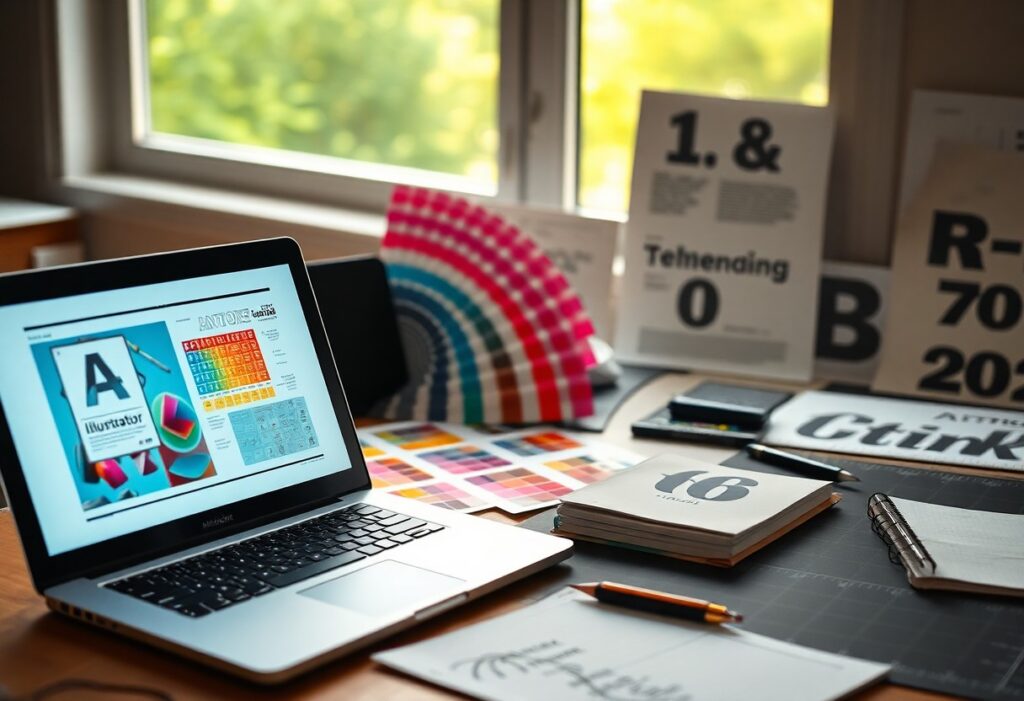
How-to Design Stunning Visuals With Practical Graphic Design Essentials
You speed projects by standardizing templates, naming, and export presets, and you should consult Embrace the 8 Essential Elements Of Graphic Design to align decisions with strong composition rules; adopting tool selection policies reduces errors and protects final quality.
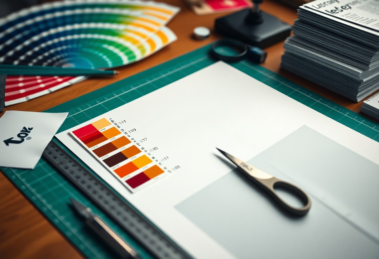
How to choose between vector and raster tools for specific project needs
Choose vector for logos, icons, and artwork that must scale without loss, and pick raster for photos and textured composites where pixel detail matters; weigh editability against final use. Assume that you can combine both by placing high-resolution raster elements inside vector layouts when necessary.
- Vector: scalable, small edits, ideal for logos
- Raster: detailed pixels, photo work, texture-rich pieces
- File size: consider performance vs fidelity
Essential factors for optimizing final exports for digital and print platforms
Optimize exports by matching color profiles (sRGB for web, CMYK for print), setting correct DPI, and adding bleed for print jobs to prevent trim issues. Assume that testing proofs and embedding fonts prevent costly reprints and screen mismatches.
- Color profiles: sRGB vs CMYK
- DPI: 72 for screens, 300+ for print
- Compression: balance quality and file size
Adjust export workflows to include soft-proofing, flattened or layered copies as needed, and automatic naming for final assets to speed handoffs. Assume that keeping export presets per target platform saves time on repeat projects.
- Soft-proofing: preview print output
- Export presets: automate common settings
- Embedding: include fonts and linked assets
Tips for maintaining organized asset libraries and version control
Organize folders by client, project, and asset type, and apply consistent naming and metadata so you can find files fast; implement simple version control like dated filenames or git-like systems for binaries. Perceiving clear ownership and archive rules prevents accidental overwrites and lost work.
- Naming: consistent, descriptive, date-stamped
- Folder structure: client → project → deliverables
- Backups: cloud + local copies
Maintain a short changelog for each project, tag master files, and schedule periodic pruning of unused assets to keep libraries performant. Perceiving agreed checkpoints for saves reduces confusion during team handoffs.
- Changelog: track edits and reasons
- Tagging: quick filtering and retrieval
- Checkpoints: regular saves and archives

Final Words
As a reminder, you should prioritize clear hierarchy, contrast, balanced color, consistent typography, and thoughtful spacing to create clarity and impact. Iterate frequently, test designs with real users, and apply practical principles so your visuals communicate purpose and professionalism.
FAQ
Q: How do I establish a strong composition and visual hierarchy?
A: A strong composition begins with a clear focal point and a defined visual hierarchy. Use grids or the rule of thirds to structure elements, apply contrast in size and color to guide attention, and group related items through proximity and alignment. Leave intentional white space to reduce clutter and to make the primary message stand out.
Q: How should I choose and apply color palettes for impactful visuals?
A: Color choices rely on the color wheel and harmony systems like complementary, analogous, and triadic schemes. Apply contrast and saturation to create emphasis, limit palettes to three to five core colors for cohesion, and test combinations against light and dark backgrounds. Include accessible contrast checks and preview designs in grayscale to ensure clarity for viewers with color vision differences.
Q: What typography rules produce readable and attractive designs?
A: Typography sets tone and controls readability across designs. Pair a distinctive headline font with a neutral body type, establish clear hierarchy with size, weight, and spacing, and keep line length between 45 and 75 characters for comfortable reading. Adjust leading, tracking, and kerning to improve legibility and preserve consistent rhythm across text blocks.
Q: Which tools and file formats should I use for different design tasks?
A: Choose tools that match the task: use vector editors such as Illustrator or Figma for logos and icons, raster editors like Photoshop for photo editing, and InDesign or similar apps for multipage layouts. Export scalable artwork as SVG or PDF and save images as PNG, JPEG, or WebP depending on transparency and compression needs. Apply the appropriate color profile-RGB for screens and CMYK for print-and keep editable source files with layers for future revisions.
Q: How can I make visuals accessible and optimized for multiple platforms?
A: Accessible visuals include descriptive alt text, high-contrast color choices, and readable font sizes across devices. Design responsively by creating layouts and assets for multiple breakpoints, provide appropriately scaled exports for retina and standard displays, and optimize images with compression and proper dimensions to reduce load times while maintaining quality. Test designs on real devices and with assistive tools to validate usability.